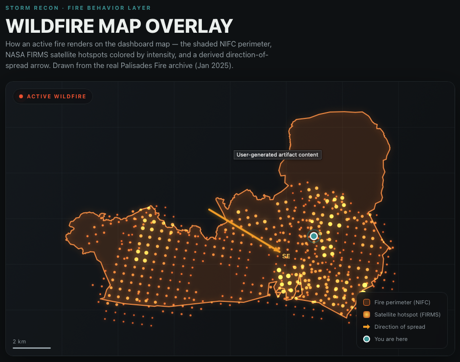
Storm Recon started as a hail app. The pitch was simple: you're parked somewhere in a camper or a rig, a storm is building on the horizon, and you deserve a first mate — something watching ahead on your behalf, not just a radar map you have to interpret yourself. Hail, then tornadoes, then flash floods. This month, wildfire.
Wildfire is a different animal from everything else on that list, and it's worth saying why before getting into what we built. A hailstorm shows up on Doppler radar. A flood has a river gauge. A wildfire has neither — no radar returns, no upstream sensor. What it has is heat, and heat is only visible from directly overhead, from a satellite passing at the right moment, or from the people already fighting it on the ground. So this feature isn't "add another weather layer." It's teaching the app to see something it structurally could not see before.
Two new instruments
We added two federal data sources, both free, both authoritative, neither invented by us.
NASA FIRMS (Fire Information for Resource Management System) reads thermal anomalies off VIIRS instruments riding NOAA's polar-orbiting satellites. Several times a day, a satellite passes overhead and reports back every spot on the ground that's radiating heat like a fire — with a confidence score and a measurement called fire radiative power, which is a genuinely useful number: it's a physical measurement of how much energy the fire is putting out at that spot, not a guess. A cluster of high-FRP detections is not the same fire as a cluster of low ones, and the map should look different accordingly.
NIFC — the National Interagency Fire Center — publishes the other half: the official incident record. When a wildfire is large enough to warrant a coordinated response, an incident command team is tracking its perimeter, its containment percentage, its acreage, and writing a plain-English behavior assessment ("crowning," "wind-driven runs," "smoldering, creeping") straight into the public record. This is the same information fire crews are working from, made public as a live GIS feed.
Put those two together and you get something neither source gives you alone: a satellite's-eye view of exactly where the fire is right now, laid inside the shape of what officials say the fire is.
The honest part: deriving direction
Here's the thing neither agency publishes: which way the fire is heading next.
NIFC gives you a perimeter. FIRMS gives you a field of hot points. Neither hands you an arrow. So we built one — carefully, and with a rule we take seriously: the app never claims to know something it's guessing at. The direction shown on the map is derived, not official, and it's labeled that way everywhere it appears.
The method is deliberately boring: when we have two perimeter snapshots in sequence, we measure how the fire's center of mass actually moved between them and draw the arrow along that line. When we only have one snapshot, we fall back to reading which cluster of fresh satellite hotspots sits furthest from the fire's center — the leading edge, in other words — and point toward that. And if the fire is burning too evenly in every direction for either method to produce a confident answer, the arrow simply doesn't draw. No direction is better than a fabricated one. That single design decision — the willingness to show nothing rather than show something invented — is the whole philosophy of this feature in miniature.
On the map, that shows up as: a shaded outline matching the official NIFC perimeter, a scatter of hotspot dots sized and colored by intensity, and — only when the data supports it — a single bright arrow. A stat readout underneath gives you the plain numbers: acreage, percent contained, hotspot count, bearing.
Stress-testing it against a fire that actually happened
New features are easy to demo on synthetic data. They're a different animal against something real. So before shipping this, we ran the entire pipeline against the archived public record of the Palisades Fire — the wind-driven wildfire that broke out in Pacific Palisades, Los Angeles, on January 7, 2025, and became one of the most destructive fires in California history.
We didn't simulate this. We pointed our test harness at the real, timestamped federal record — NWS fire-weather alerts, the SPC's fire-weather outlook, NASA FIRMS' archived hotspot detections, NIFC's archived perimeter — and replayed it forward from four days before ignition, exactly as it happened, with no hindsight. Every run of this test is fully reproducible: the archive is cached locally, so the second run pulls zero bytes over the network and reproduces the identical result. That reproducibility matters to us more than it might sound like it should — it's the difference between "this seems to work" and "this can be checked."
Here's what the replay showed:
T minus 92 hours · Saturday morning
A Fire Weather Watch goes up for the Santa Monica Mountains. This is worth pausing on — a watch like this is never delivered as a Wireless Emergency Alert to anyone's phone. WEA only fires on warnings. Four days of lead time, and the only way most people learn about it is by checking.
T minus 44 hours · Monday night
That watch is upgraded to a Red Flag Warning — an extreme Santa Ana wind event, the exact ingredient that turns a spark into a firestorm. Also not a WEA product.
T minus 24 hours
The Storm Prediction Center's fire-weather outlook shows an elevated risk for the area — 15% above baseline, in the outlook's own terms.
T plus 0 · Tuesday, January 7, 10:30 AM local
Ignition. In the replay, 558 satellite detections arrive and get fused with the incident perimeter; the derived arrow points southeast. The fire eventually grew to 23,448 acres.
T plus 7h 45m
A second fire — the Eaton Fire — ignites 44 kilometers away, part of the same Santa Ana wind event.
T plus 11h 40m
A third, the Hurst Fire, 27 kilometers out.
T plus 52 hours
A fourth, the Kenneth Fire, 12 kilometers out.
That last stretch is the part that made us rewrite a piece of the logic. An evacuation route chosen when one fire is burning can drive straight at a second fire that ignites six hours later — which is exactly what happened across Los Angeles that week, with roads closing unpredictably in multiple directions at once. So every new ignition in the replay triggers the same instruction: reassess your route before you drive. Not a new alert shouting over the last one — a nudge to re-check, because the map changed under you.
One honest caveat, in the spirit of the rest of this: NIFC's public feed carries a fire's final archived perimeter and behavior tags, not a moving history of them. So our test pairs that final 23,448-acre, fully-contained shape with the real satellite detections from the fire's first violent day, to exercise the fusion logic against real numbers. We're flagging that plainly here for the same reason the app flags a derived arrow as derived — a data-vintage mismatch inside a historical replay is a fine thing to test with, as long as nobody mistakes it for how a live fire would actually render (perimeter and hotspots share one timestamp, live).
Where this points next: push notifications
Everything above happens on the map. The next question is whether it should also happen on your lock screen — and this is where we've been the most deliberately careful.
The four-day watch and the two-day warning in that timeline never reach a phone through the Wireless Emergency Alert system. WEA is real, it's fast, and it's already doing its job for the warning tier — the moment a Red Flag Warning becomes a wildfire and evacuation orders go out, that's a WEA event. What WEA structurally cannot do is tell you four days out that the wind is coming. That gap — the quiet, careful-attention window before anything is on fire yet — is the only place a notification from us would add something WEA doesn't already provide.
We're not turning that on yet. What we did instead was write the actual notification copy for every stage of that Palisades timeline — the watch, the warning, the ignition, each new fire — and run it through the same historical replay, as a dress rehearsal with nothing actually sent. It reads, for the ignition moment:
Draft push notification · ignition
"A fast-moving wildfire has started near Pacific Palisades and is spreading southeast. Drive out now, away from the fire and smoke. Don't wait for an evacuation order to reach you."
That's deliberate: our copy, not a paraphrase of the official language, written in the same plain, first-mate voice as the rest of the app — and tested against a real disaster's real timing before it ever goes near a real person's phone.
The actual theme here
None of this works by being clever. It works by being honest about three things: what the federal government's own instruments actually measured, what we derived on top of that and are willing to say we derived, and where the boundary between the two sits on the screen. NASA and NIFC did the hard part — a functioning satellite constellation and a nationwide incident command structure are not things an app builds. Our job is to fuse what they publish, refuse to invent what they don't, and say which is which, every time.
That's the bar for "smarter." Not a bigger model. A more honest one.